Wisp
Art Direction
Creative Direction
Brand Identity
Visual Design
Web Design
The Opportunity
Since its launch in 2018, Wisp aimed to make sexual healthcare inclusive, cost-effective, and accessible for everyone. However, the brand struggled with legitimacy in a rapidly growing market. Wisp needed a cohesive brand strategy, a clear visual identity, and an improved product experience to connect better with patients and stand out from competitors.
Role
Founding Designer > Design Director
Industry
Healthtech
The Logo: Before/After
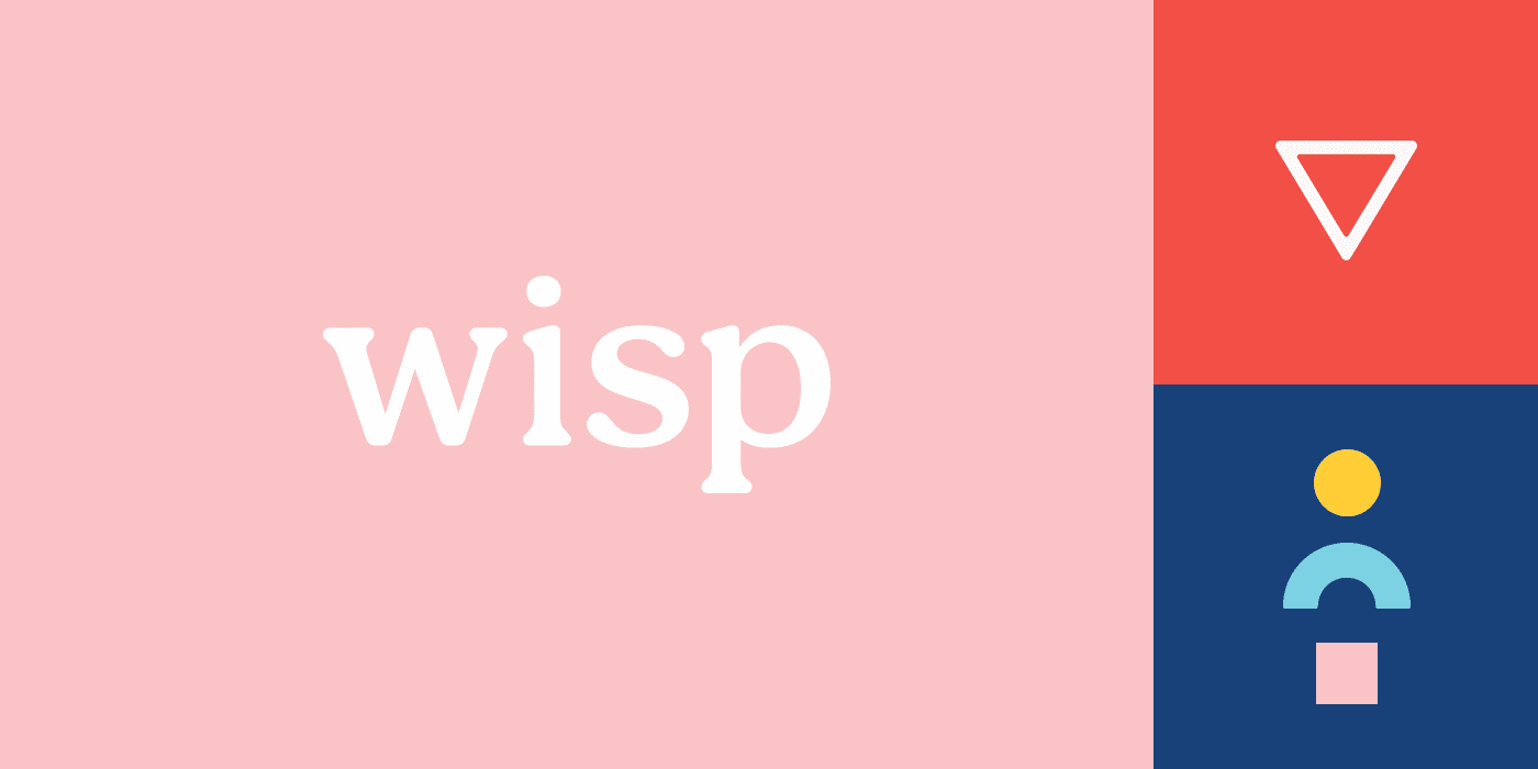
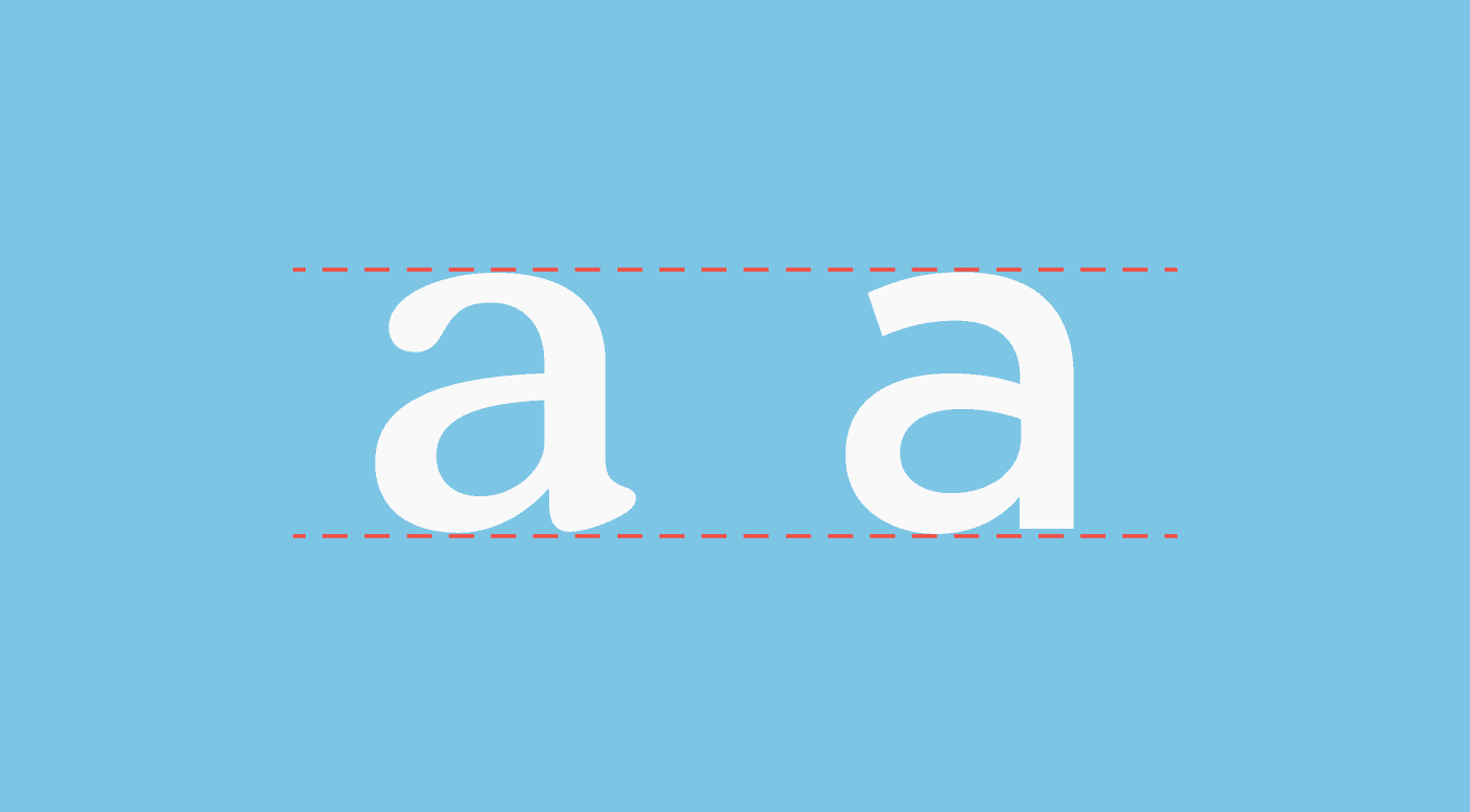
The rigidity of the original logo made it feel less approachable than Wisp ideally wanted. Practically, it was also challenging to read at small sizes as the stroke widths were quite small. Comfort, classic, and a bit of a throwback, the new logo has a lot to offer. Its friendly serifs are approachable and the rounded body of the letterforms is inviting.
Palette
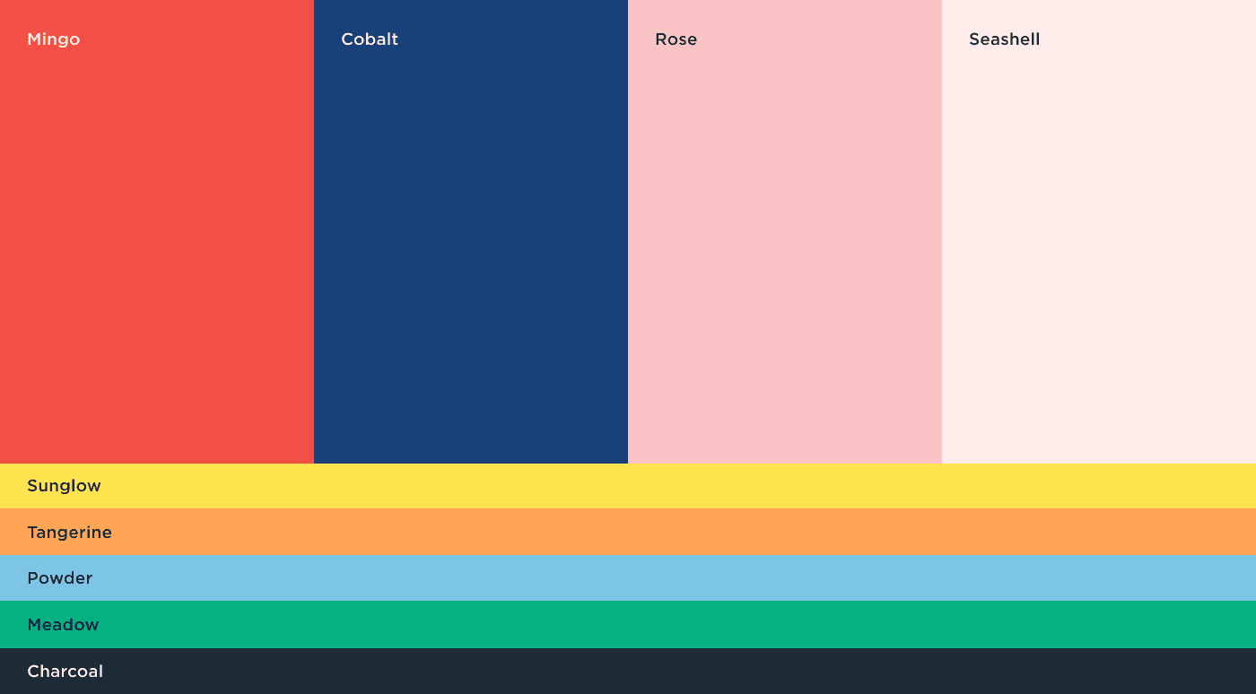
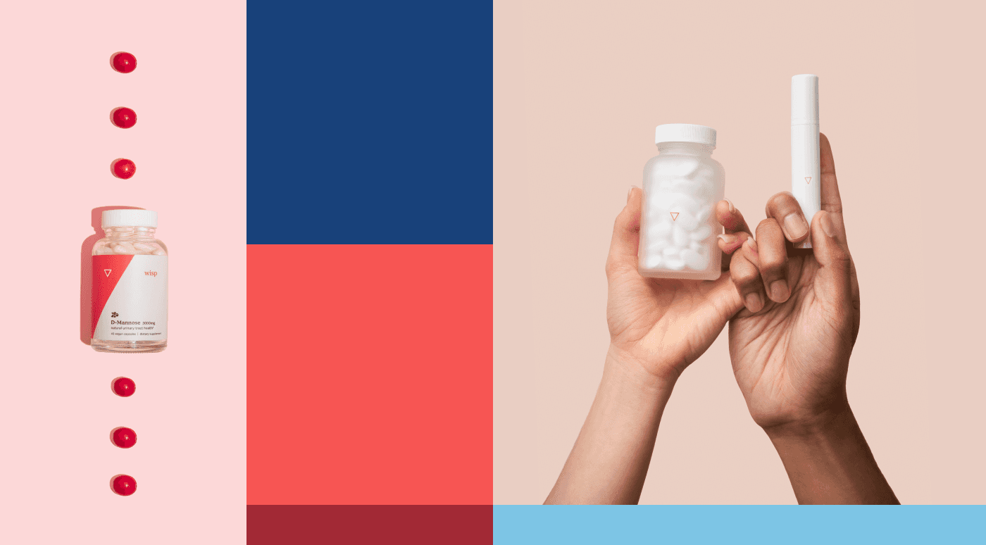
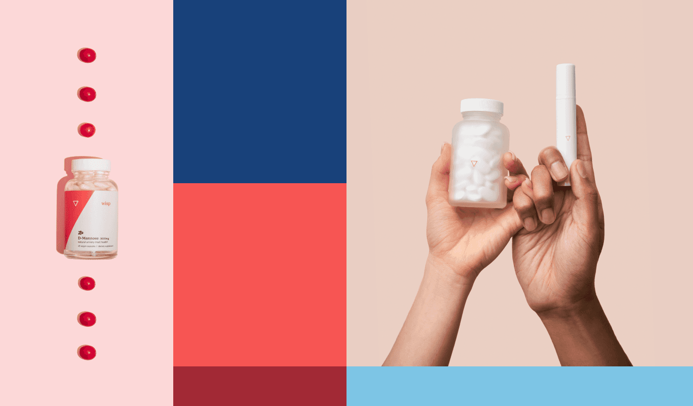
The primary color, “Mingo” (the bright coral shade) represents: love, compassion, care, and empathy — reminding us of the importance behind Wisp's favorite mantra: “love yourself first.” Mingo’s benefits are many: it offers a mature, more inclusive primary brand color and is up to par with the accessibility standards wisp is prioritizing. Wisp's other supporting star, Cobalt, adds familiarity with a modern take on the primary blue often seen in the traditional medical space.
Typography
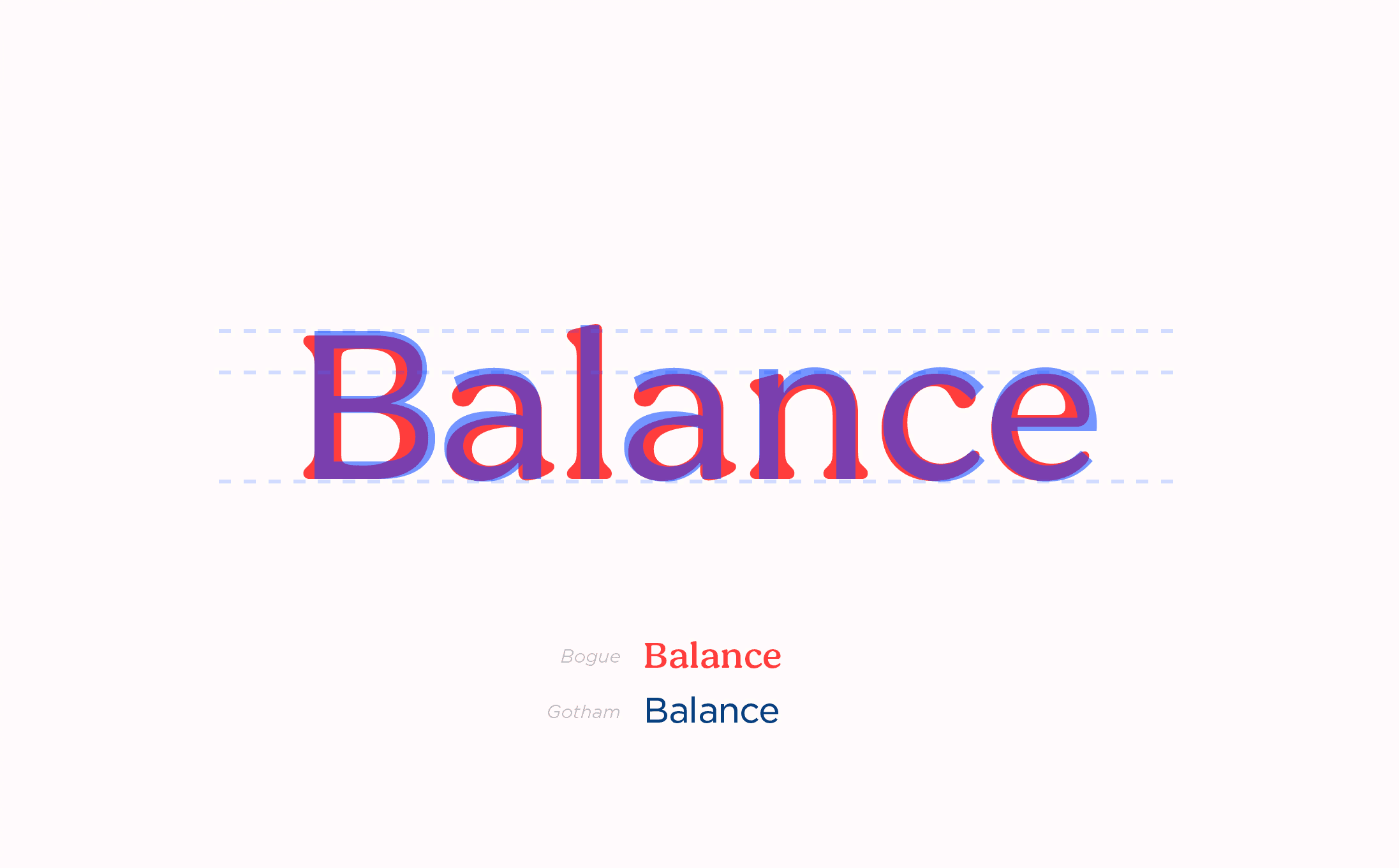
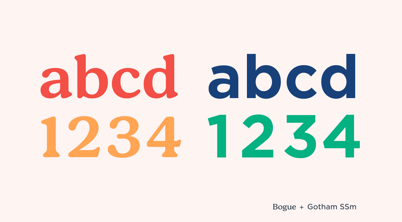
The lettering pair of Bogue and Gotham is sophisticated, yet approachable, and their balance underlines the balance they wish to help their patients achieve in their healthcare. Plus, both typefaces offer a robust font family and are great for text at small sizes making them great for readability.
Creative + Art Direction
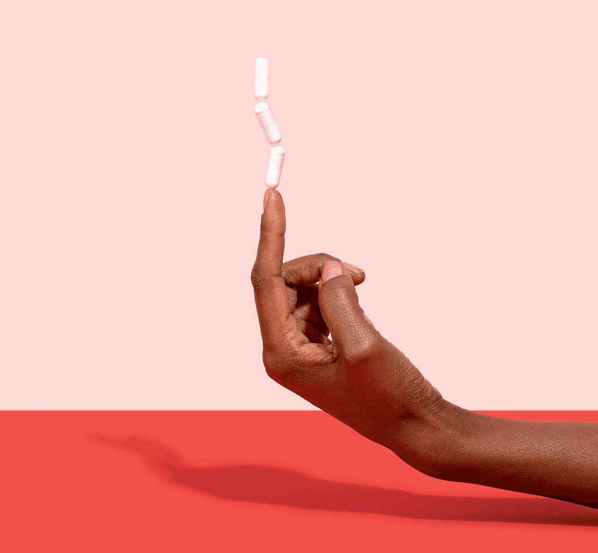
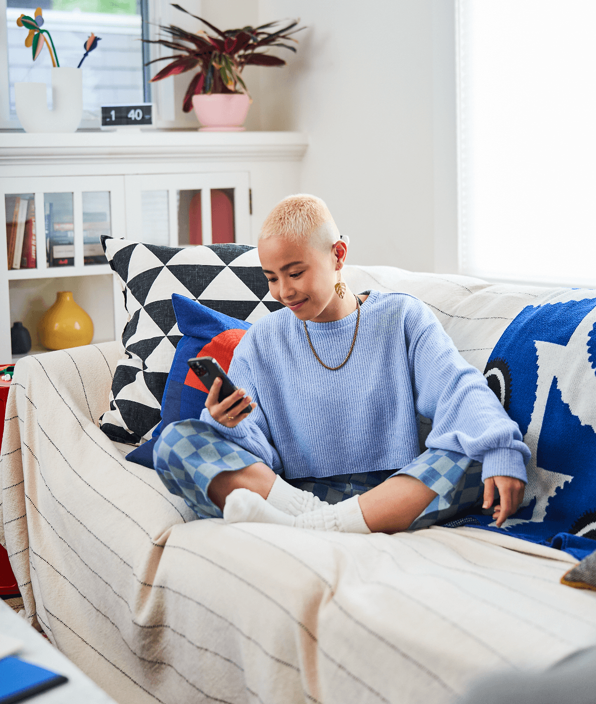
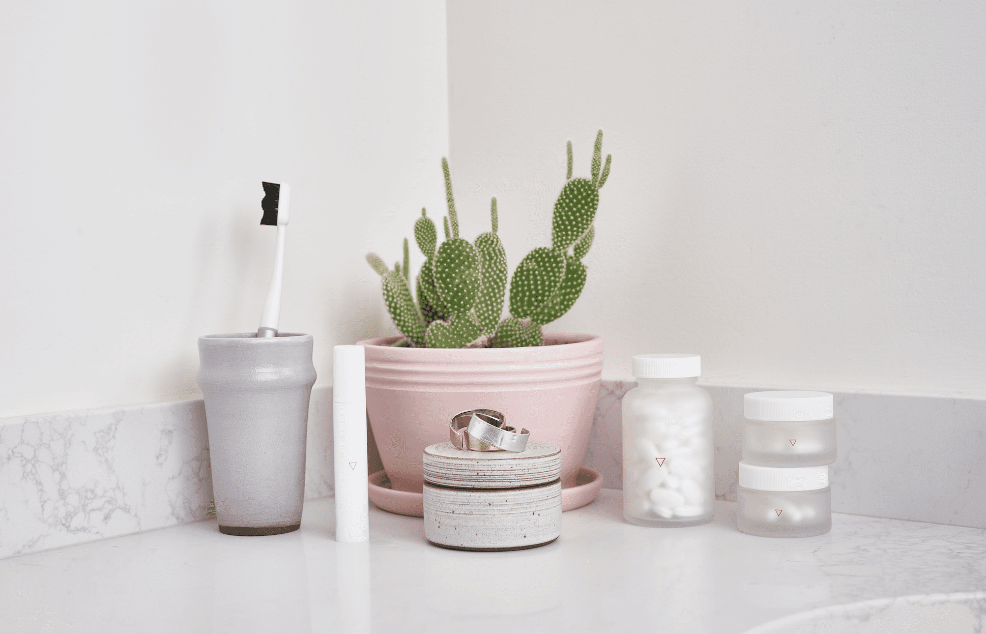
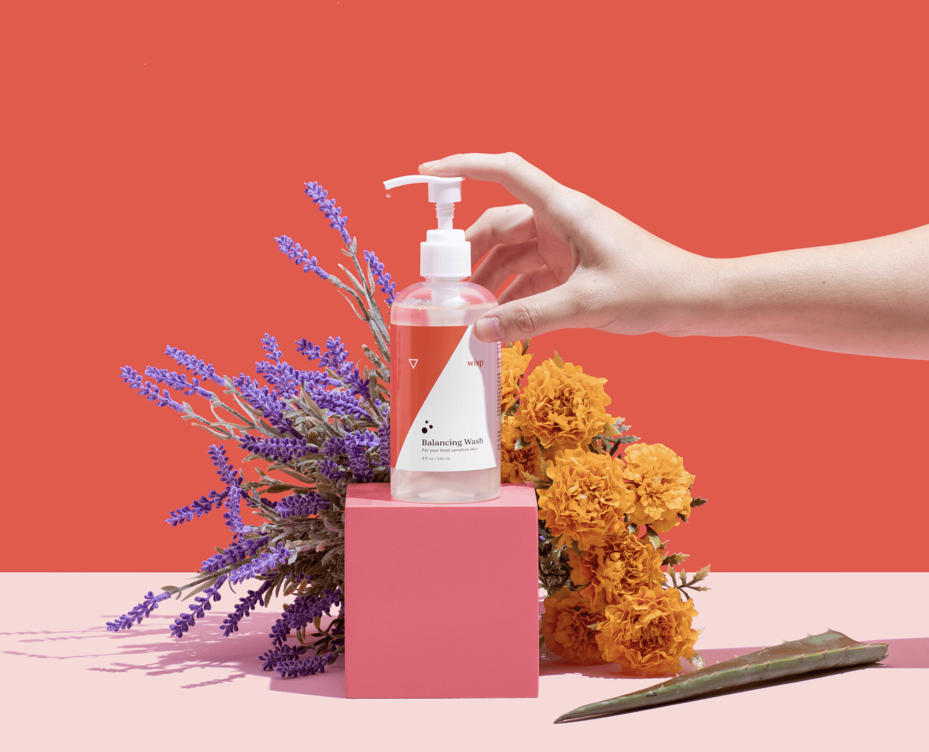
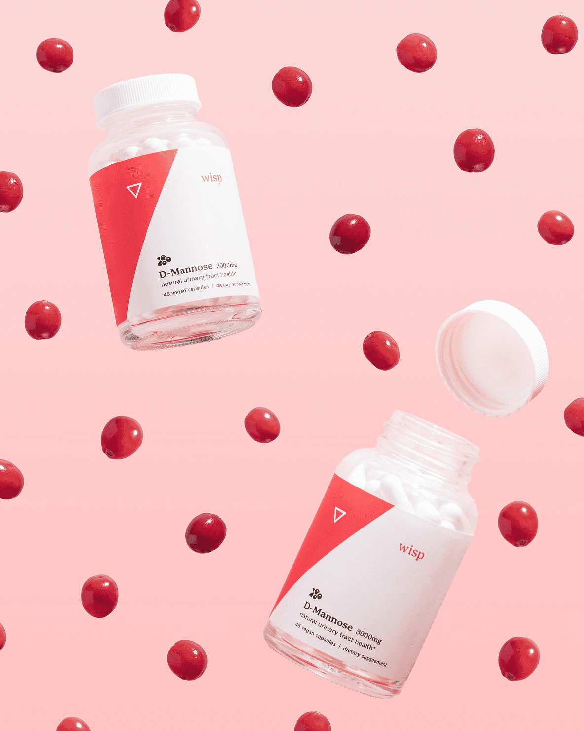
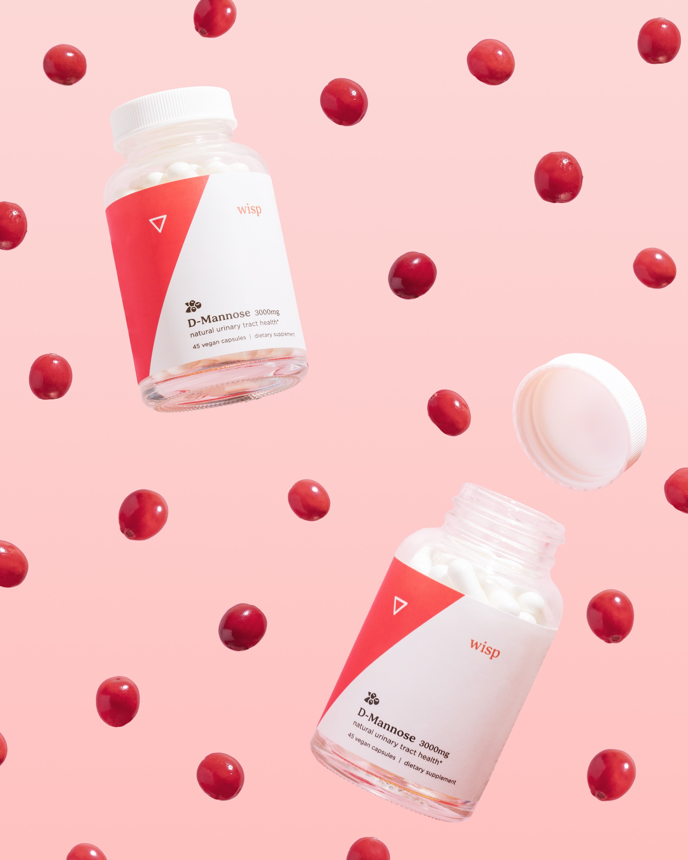
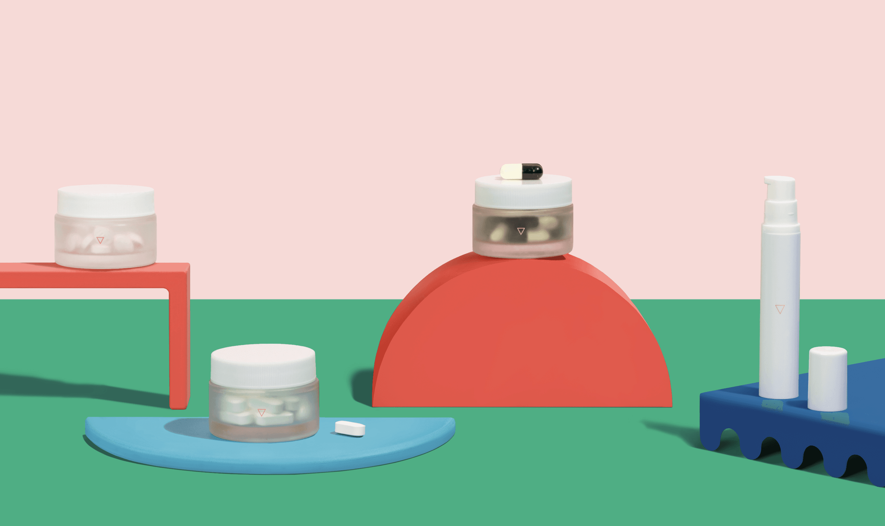
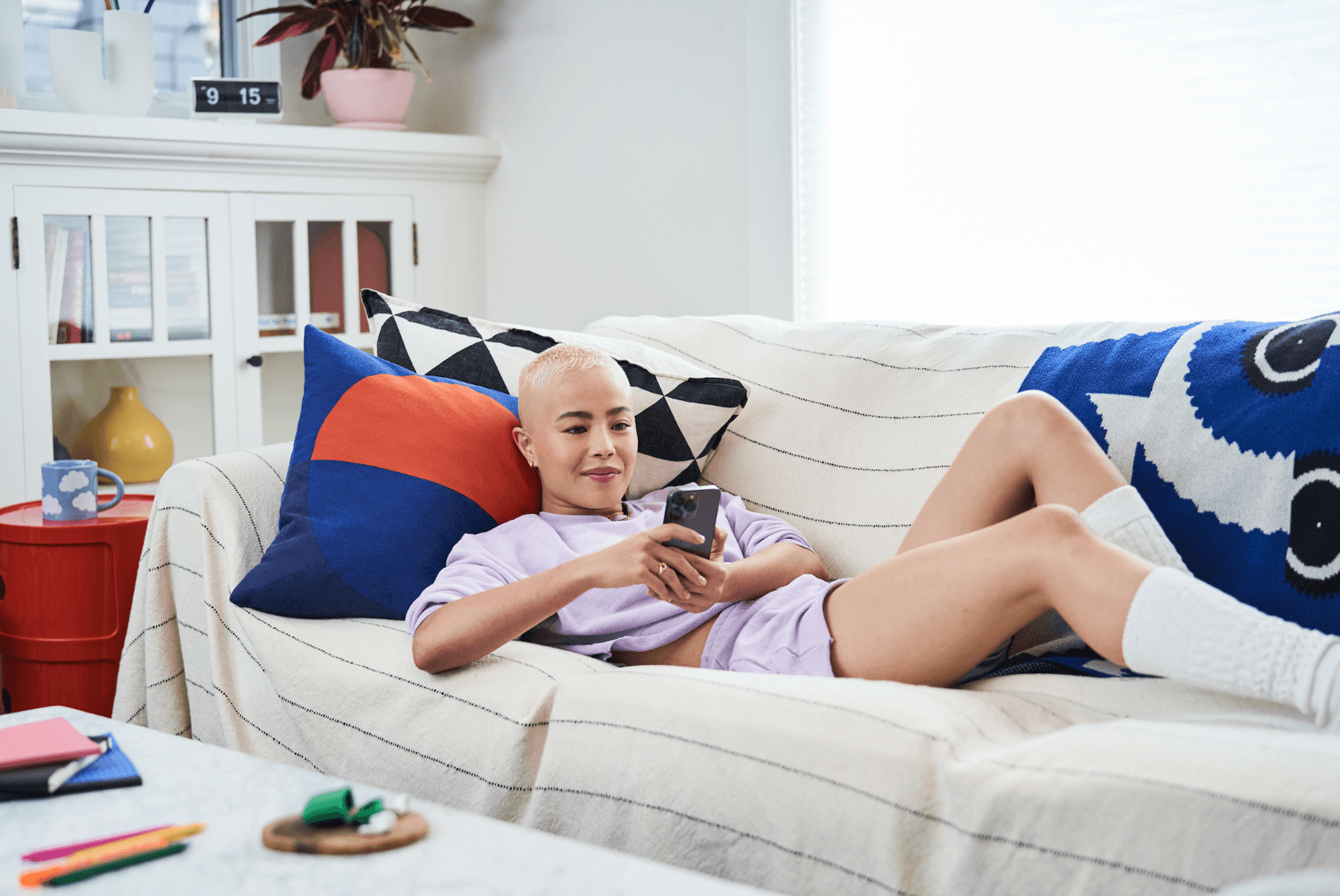
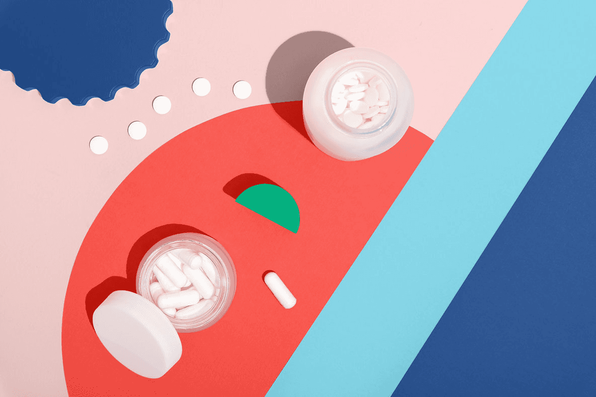
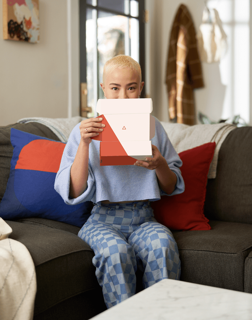
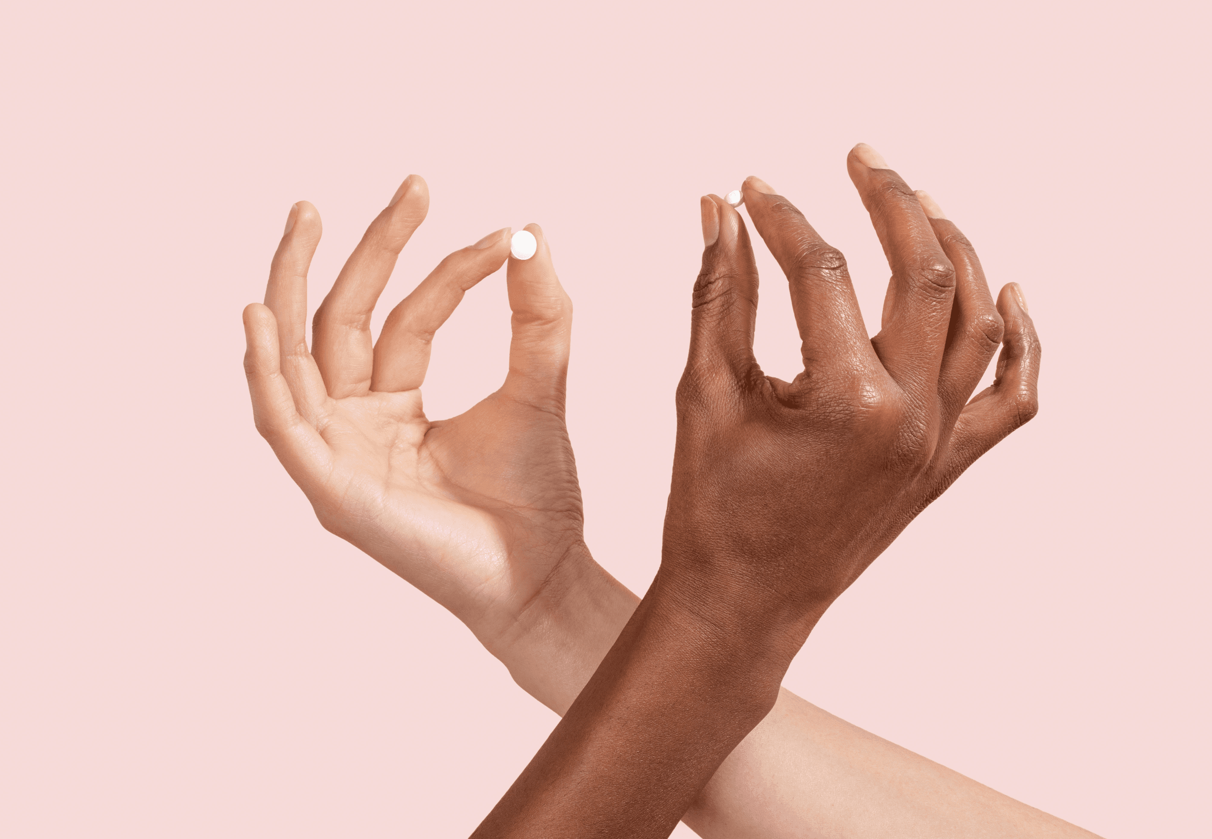
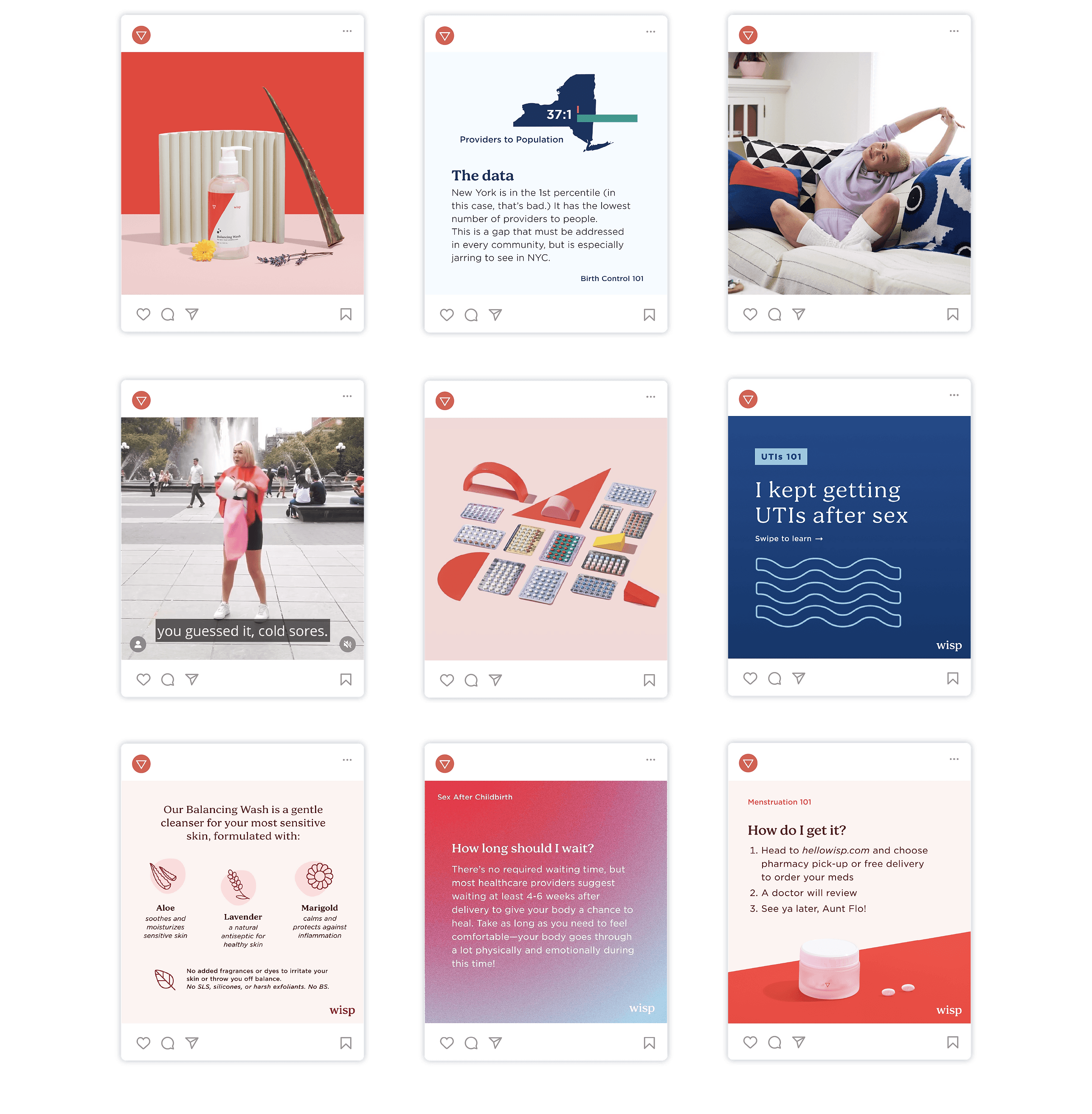
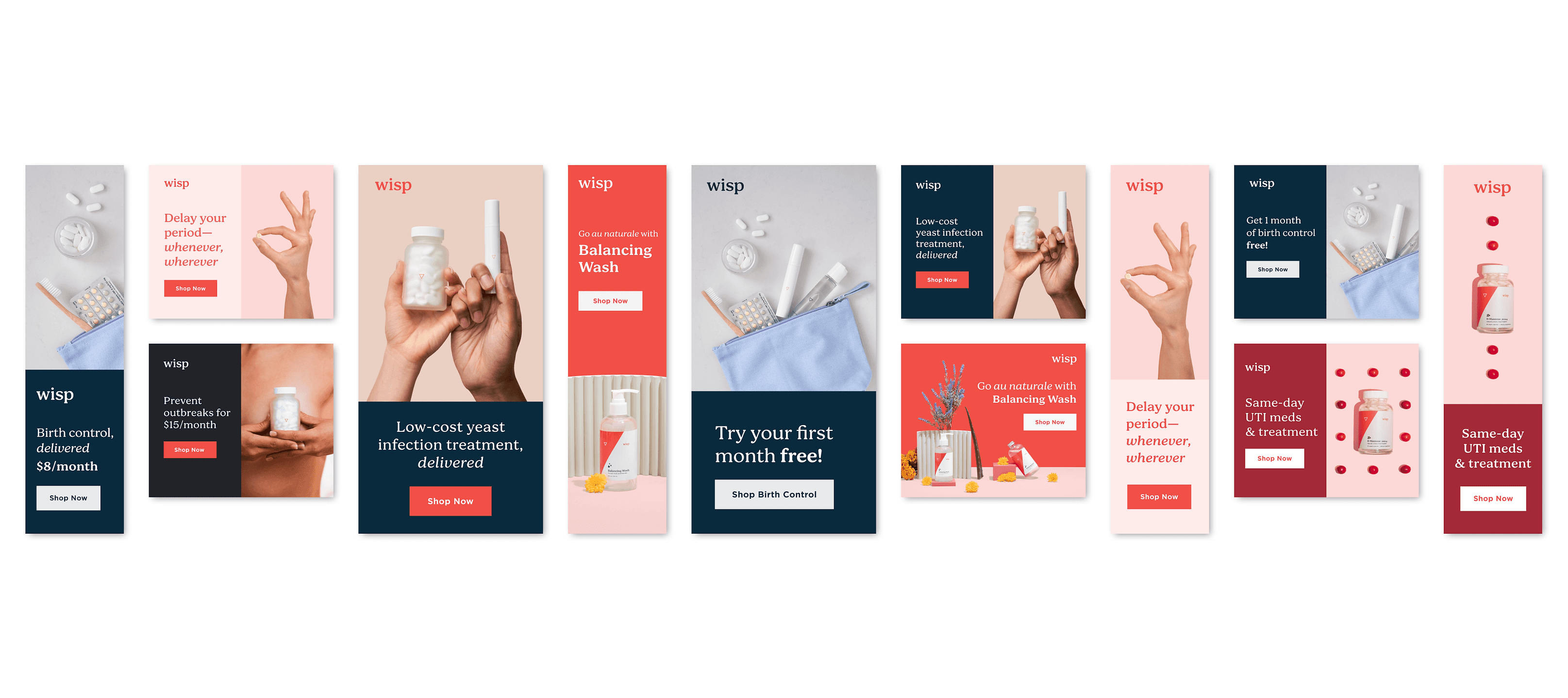
I organized, planned, and directed multiple photoshoots, amassing several hundreds of proprietary images for cross-channel use.
Website
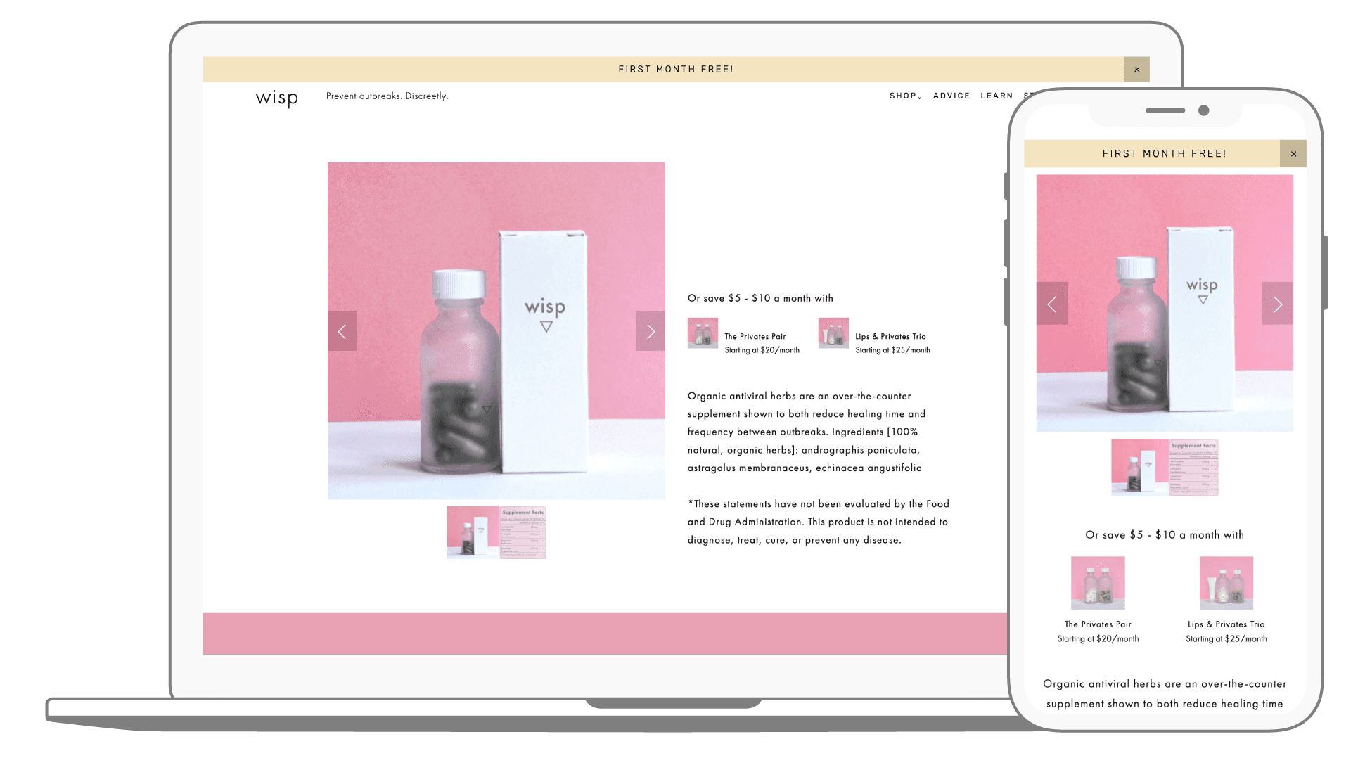
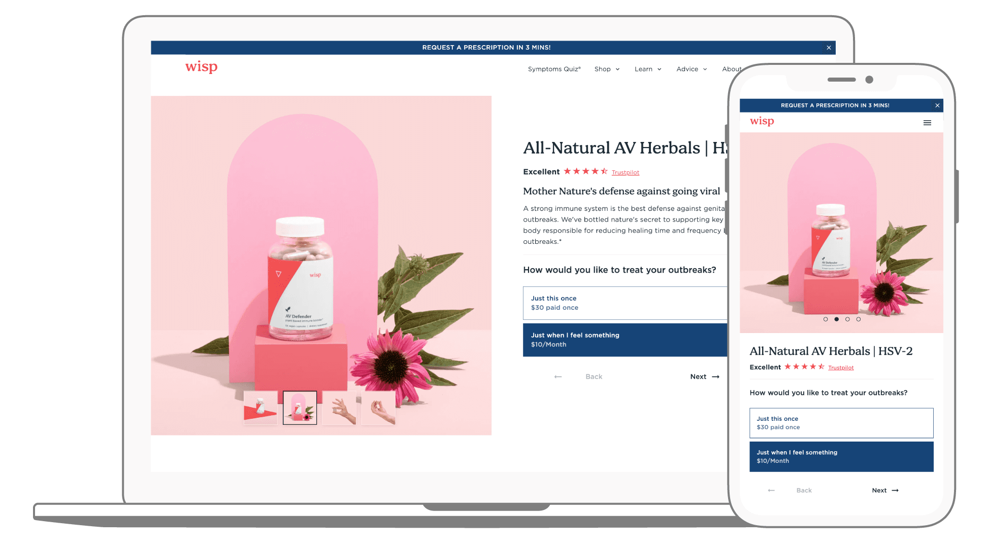
Before and after product page including new photography assets (featuring the rebranded labels), simplified grid system, overhauled messaging, styling, and upgraded functionality.
Email campaigns
Set the creative direction to overhaul Wisp's email design flow catalog, including 13 total flows, with a combined 41+ emails
Credits
Design Director: Shallin Mayher
Marketing Director: Conor Monohan
Visual Designer: Heather Maehr
Product Designer: Wanda Valentino
Brand Writer: Kathleen Morrison
External Partners
Producer: Annie Tonsiengsom
Producer: Fran Bittakis
Photographer: Christine Dong
Photographer: Photographer
Photographer: Diane Villadsen
Illustrator: Allie Sullberg
